Oct 02 - Oct 16 · Week Four · Studio Practices
The UX of Digital Interfaces
Revati Banerji I MA UX Design I London College of Communication
Brief: Design a physical environment derived from a digital one
Team: Mingzhi Zhang · Shivangee Mishra · Xiyan Lou · Muskan Gupta · Diya Agrawal
We began the week by asking: What makes Hinge unique? What sets it apart from other dating apps?
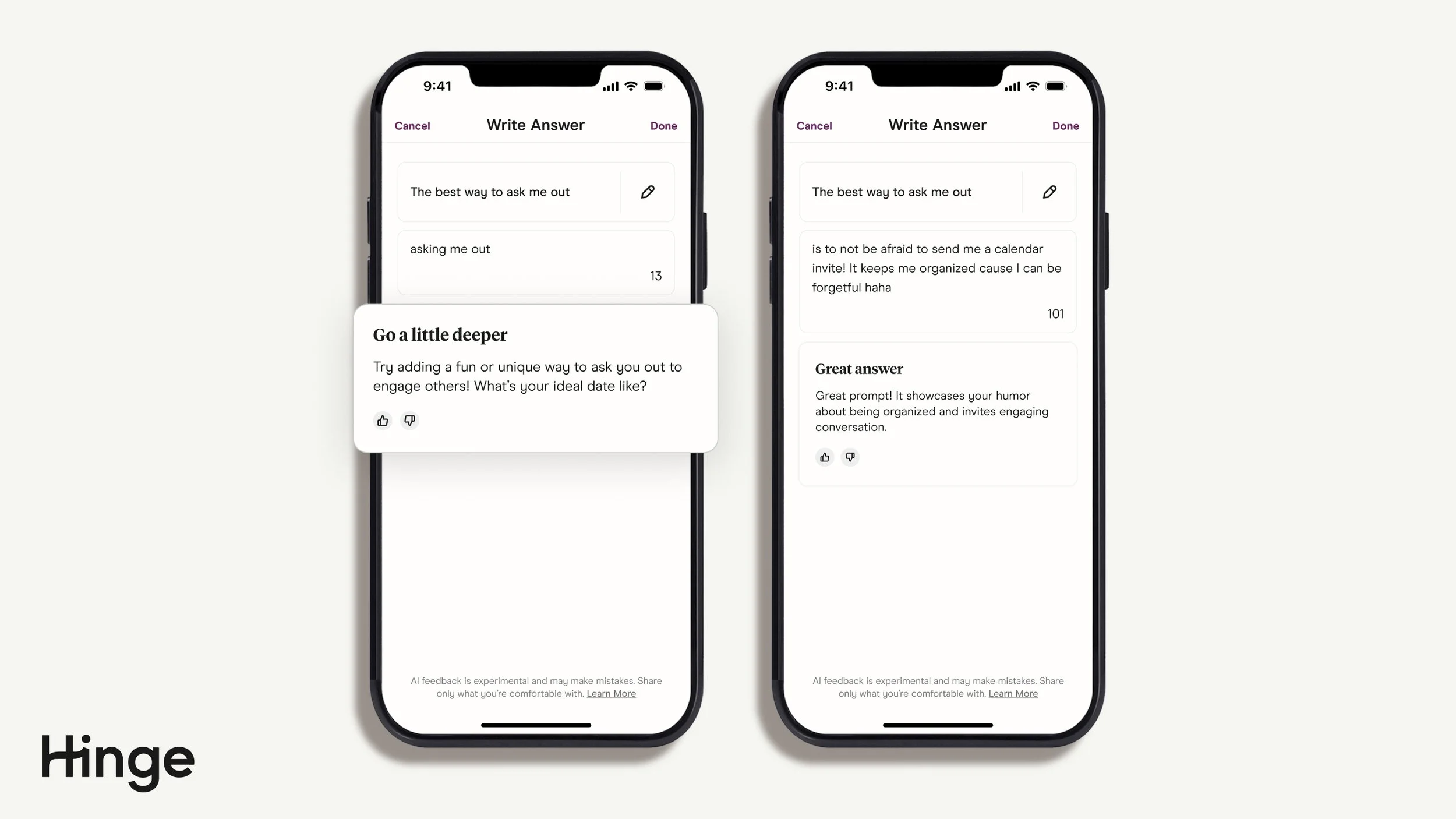
To answer this, we revisited our artefact analysis and downloaded competitor apps to compare user journeys. One key difference stood out. While apps like Tinder and Bumble prioritise large, full-screen profile photos, Hinge gives equal weightage to images and written prompts. This balance allows users to express more personality and depth beyond appearance alone.
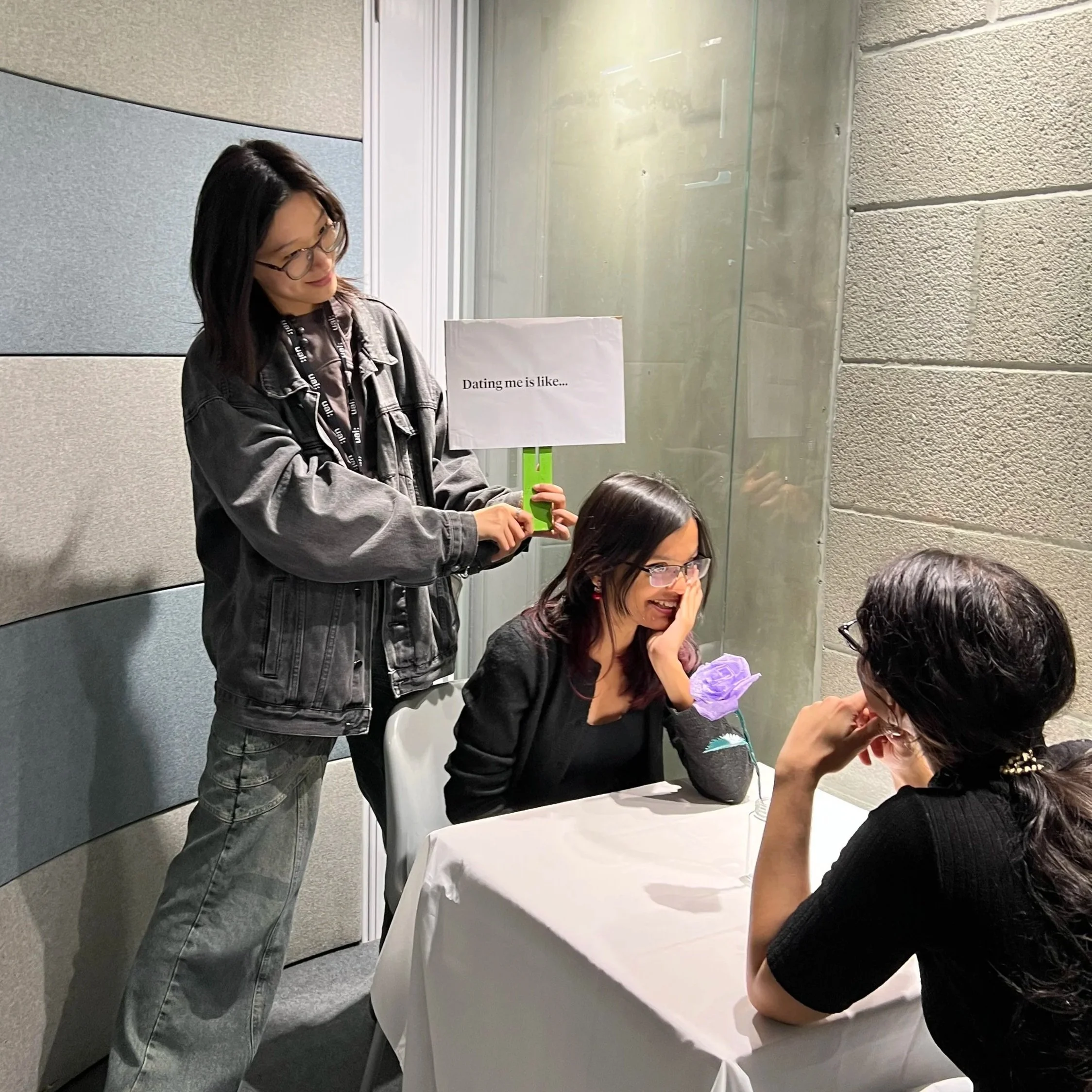
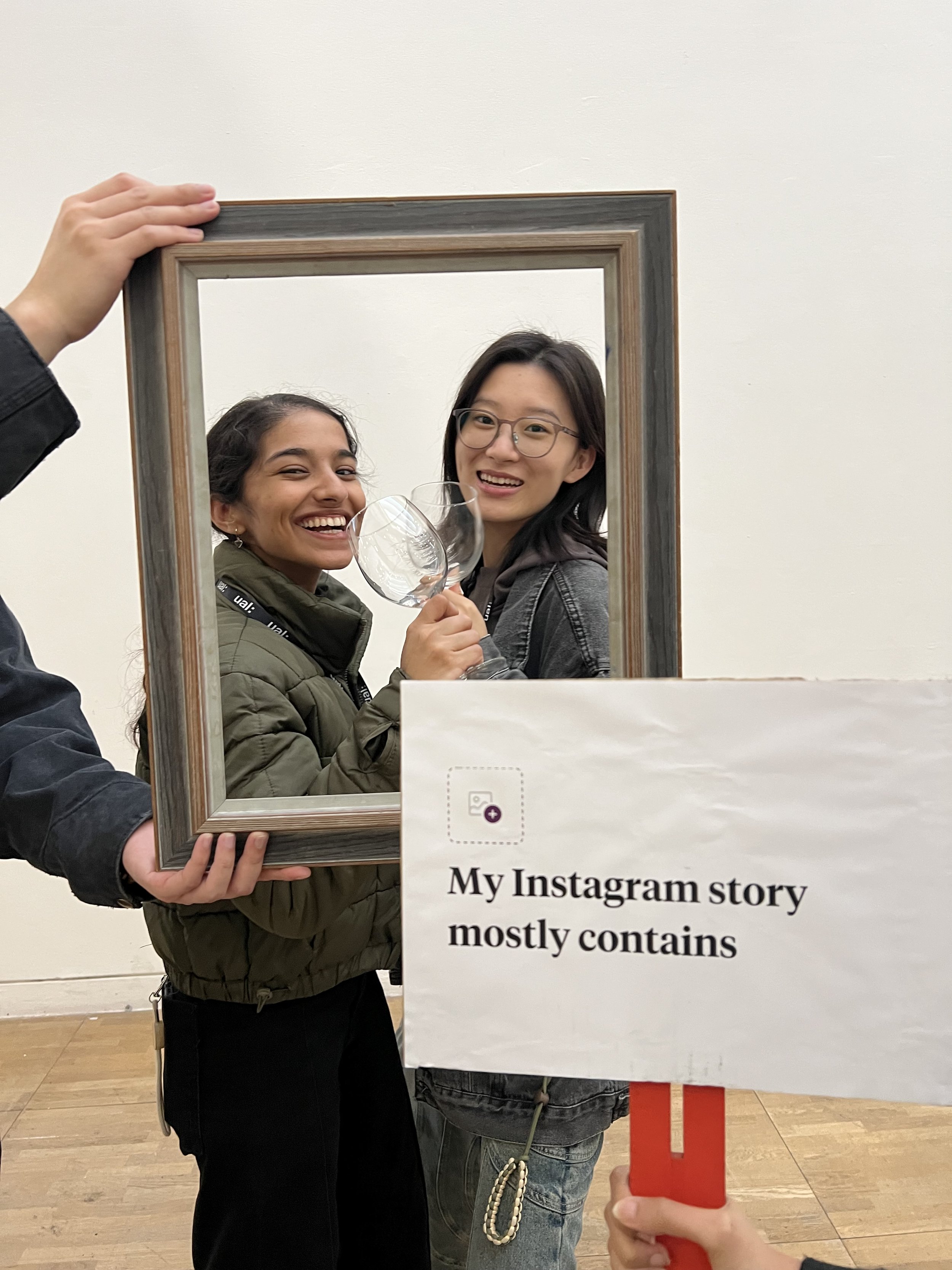
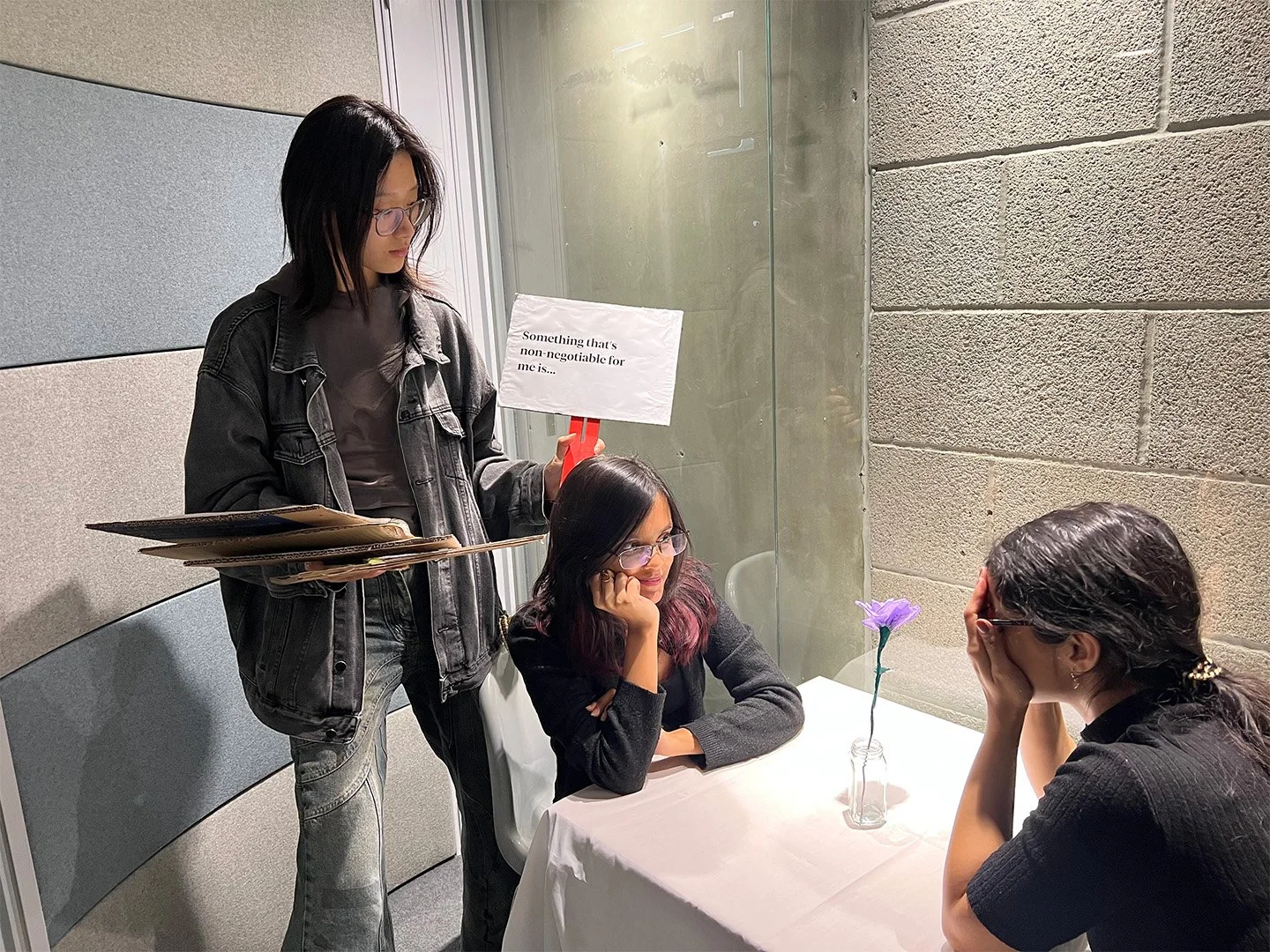
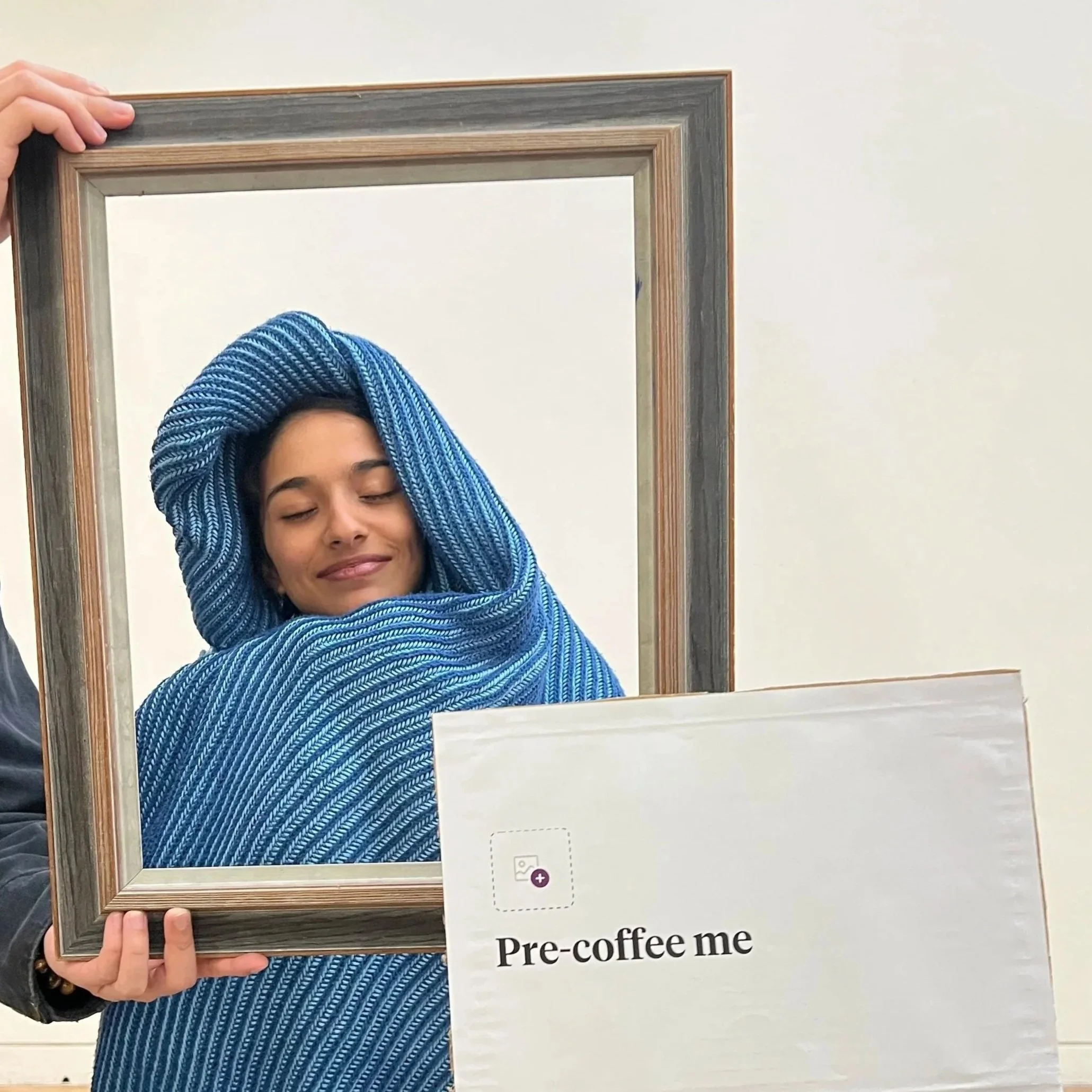
We also included image prompts to introduce a visual element and make the experience feel more like Hinge. When a picture prompt was chosen, a teammate would run in holding a picture frame and relevant props, prompting the actor to strike a pose.
Outcome
To explore this behaviour, we designed an interactive exercise. Two group members acted as people on a Hinge date in the centre of the room. Selected audience members held printed Hinge prompts on paddles. Whenever an audience member raised a prompt, the actor facing them had to answer it, mimicking how Hinge facilitates conversation in online dating. The two actors responded with scripted answers in real time, recreating the back-and-forth of an online interaction.
Picture
Prompts
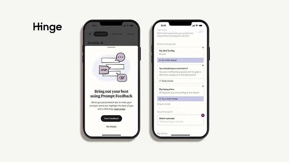
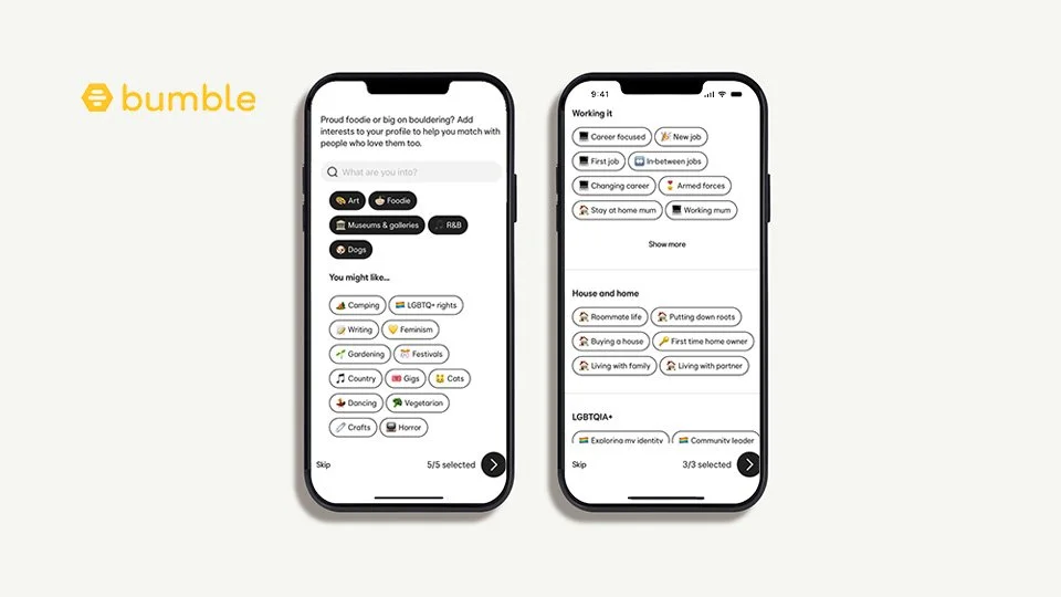
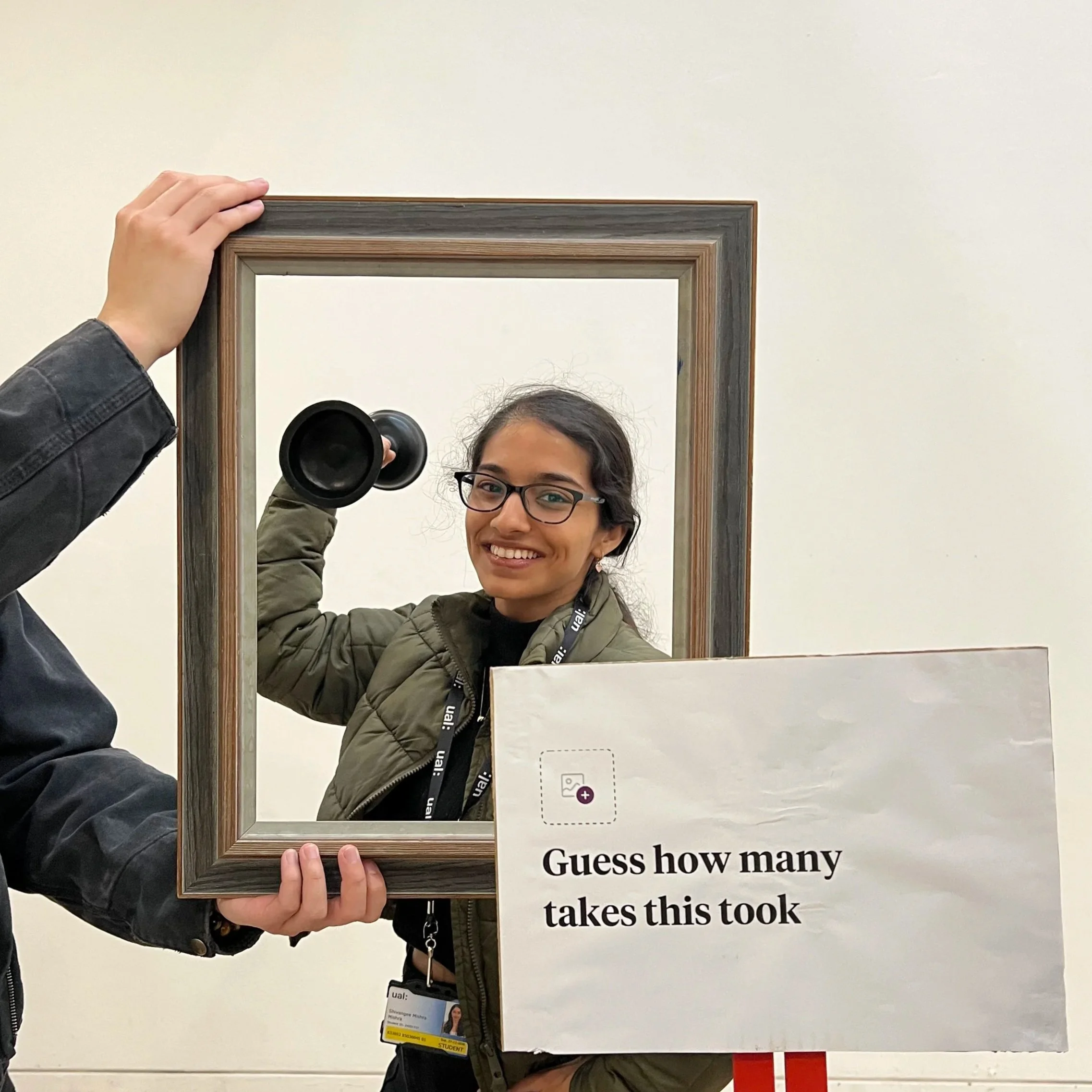
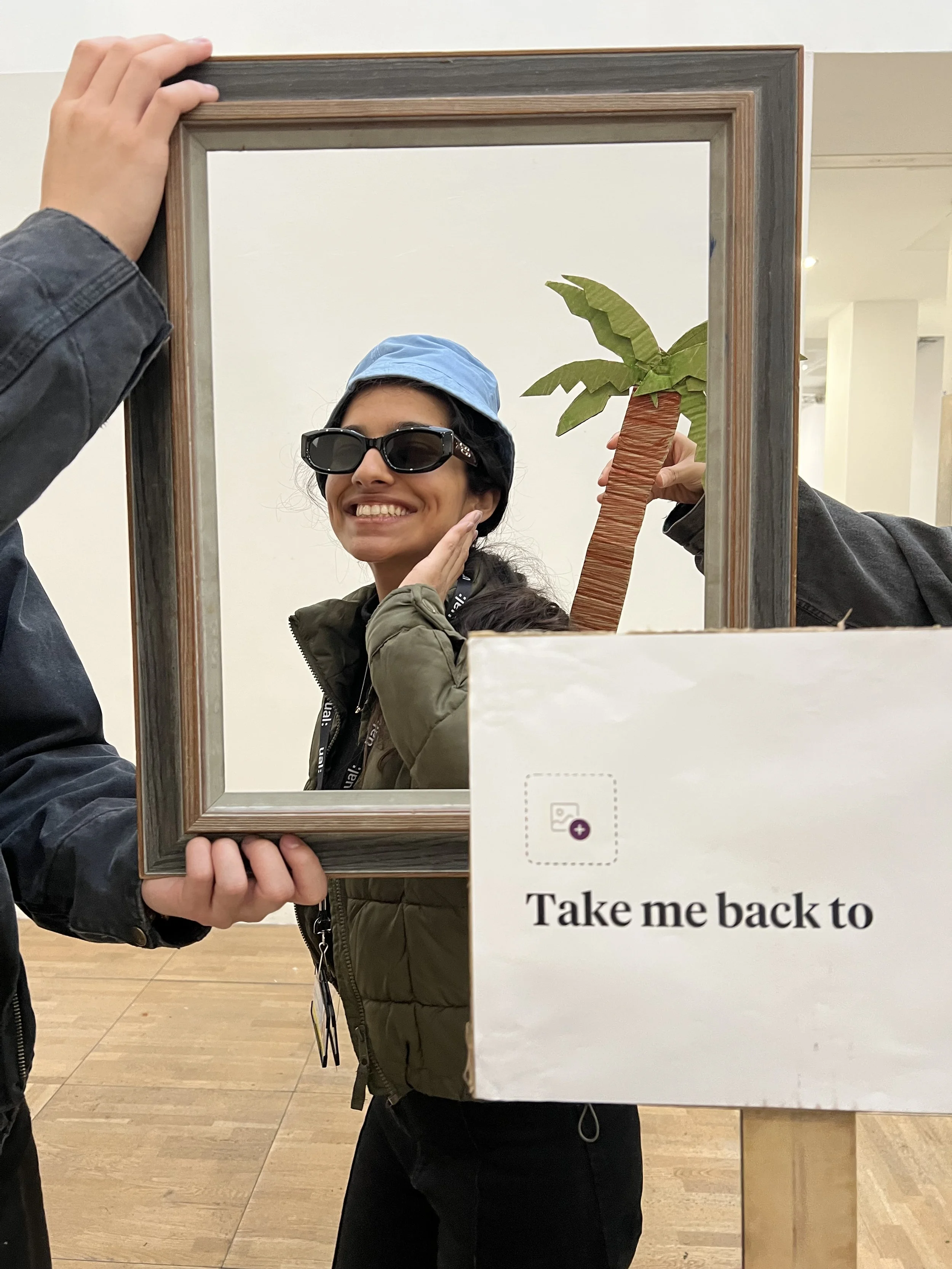
Fig. 2. Hinge prompts users to share more about themselves, leading to more complete profiles. Images from the Hinge toolkit.
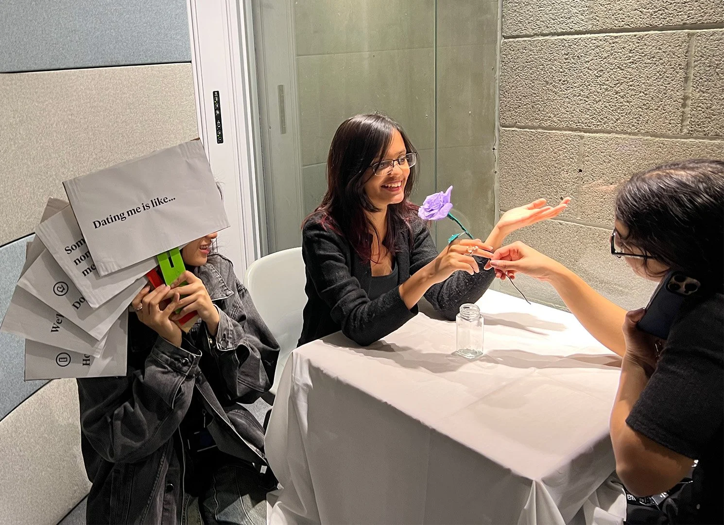
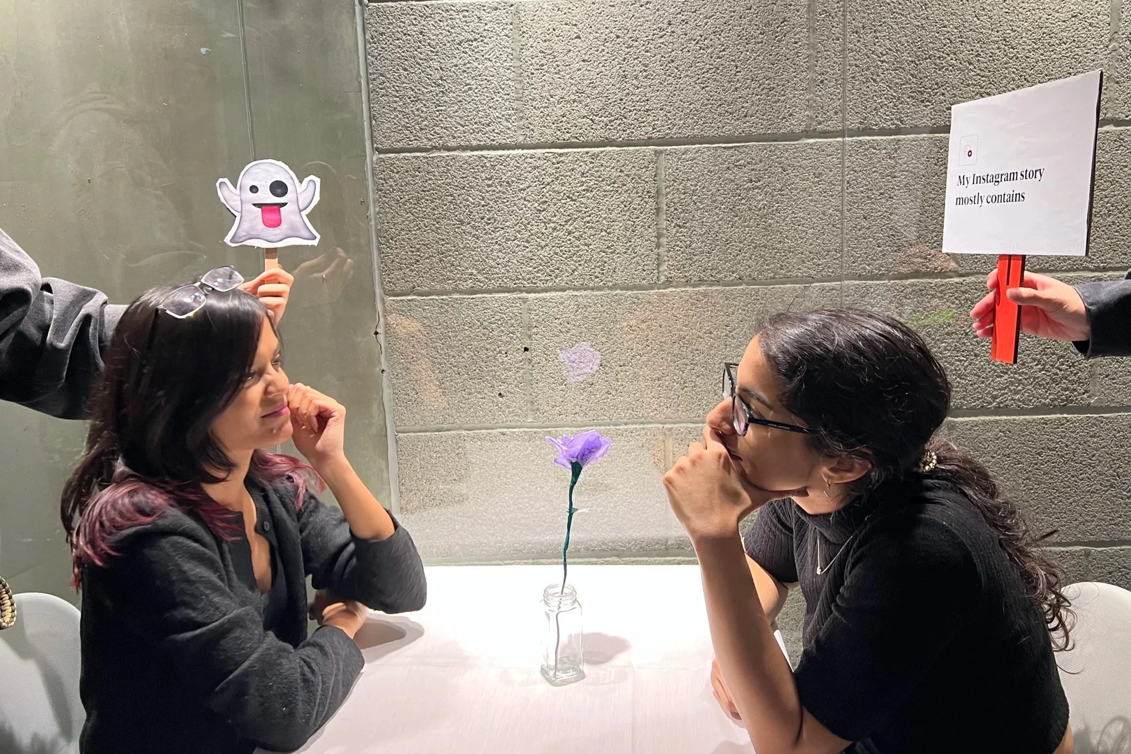
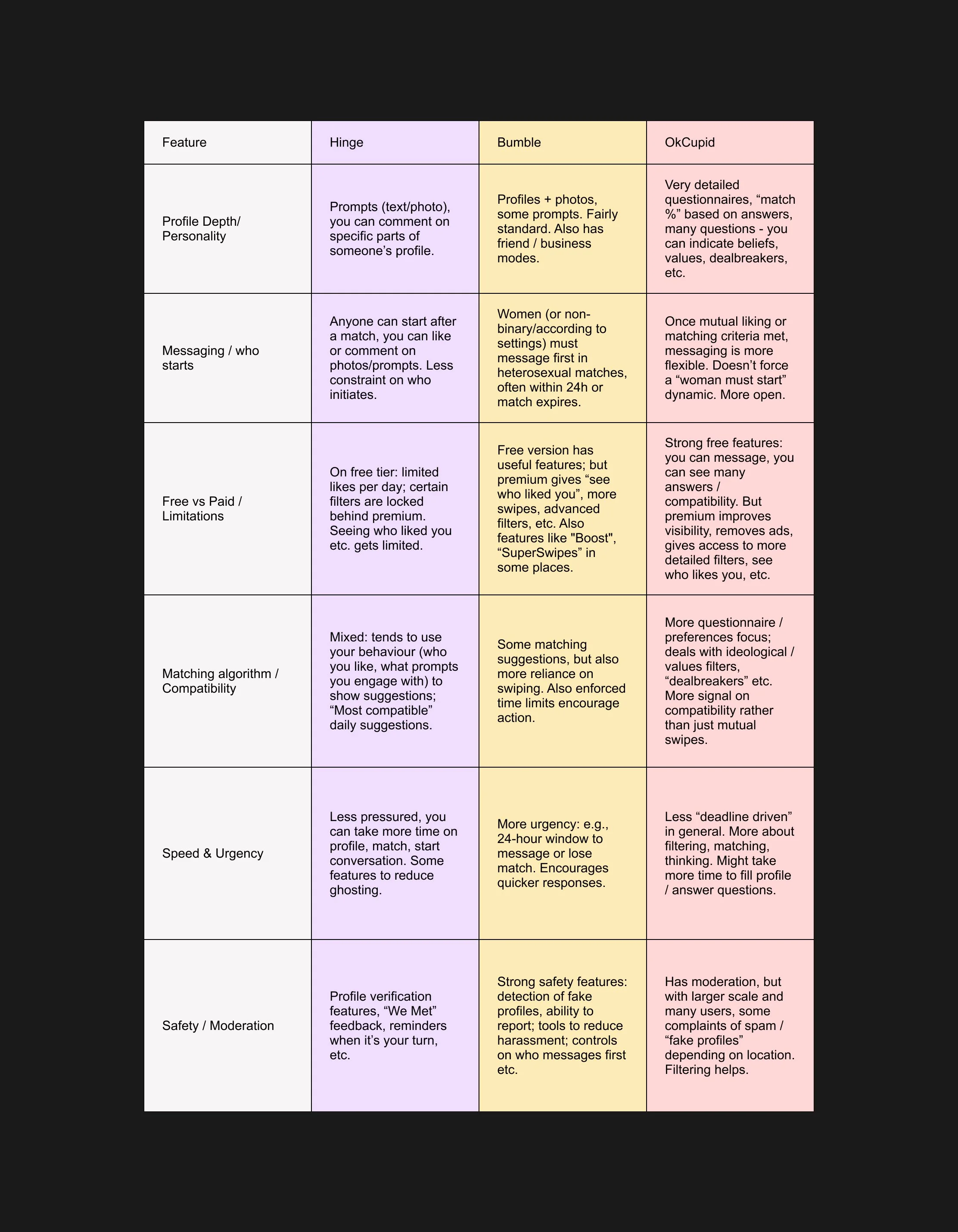
Fig. 4. Props for the picture prompts. Photography by author.
Fig. 3. Photography by author.
However, the performance did not go entirely as planned. We didn't get to test the concept properly and spent more time on finalising the script and research. We realised too late that not everyone was familiar with Hinge’s interface, which led to some confusion. In hindsight, the exercise would have benefited from a simpler structure and insight. Less is more.
If I revisited this brief, I would explore the contrast between the polished, curated digital version of dating profiles with an unscripted real-life date conversation, questioning what happens once the screen disappears and real interaction begins.
Fig. 1. Bumble asks users to pick from predefined tags rather than open-ended written prompts like Hinge. Competitor Analysis compiled by Muskan Gupta and Diya Agrawal.
We also noticed that Hinge has removed the swiping mechanic that most apps use for liking or rejecting a profile. By removing the mechanic of swiping, Hinge makes rejecting someones profile passive and encourages users to spend more time considering each profile. Every Hinge user must complete at least three prompts, adding context and individuality to their profile.
Users can also attach a comment when liking a photo or prompt, shifting the experience from passive scrolling to active engagement. Although Hinge requires more effort to set up, it appears to attract people willing to put in that effort in return, positioning the app as a more intentional space within the world of online dating.