Nov 27 - Dec 11 · Week Eleven · Studio Practices
The UX of Text
Revati Banerji I MA UX Design I London College of Communication
Brief: Design an experience that reveals the materiality of text
Team: Sakshi Pansares · Merrin O’Connor · Xiaoqin Qin · Vibhooti Sharma · Jaime Santos Guerrero
It’s the last brief of the term. I feel like we were just getting started.
We did some quick brainstorming research to unpack some topics mentioned in the brief.
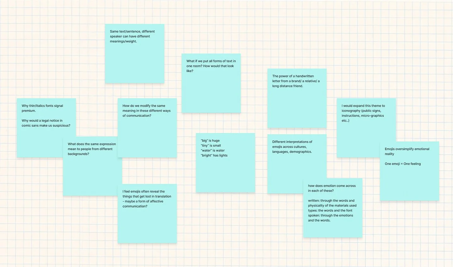
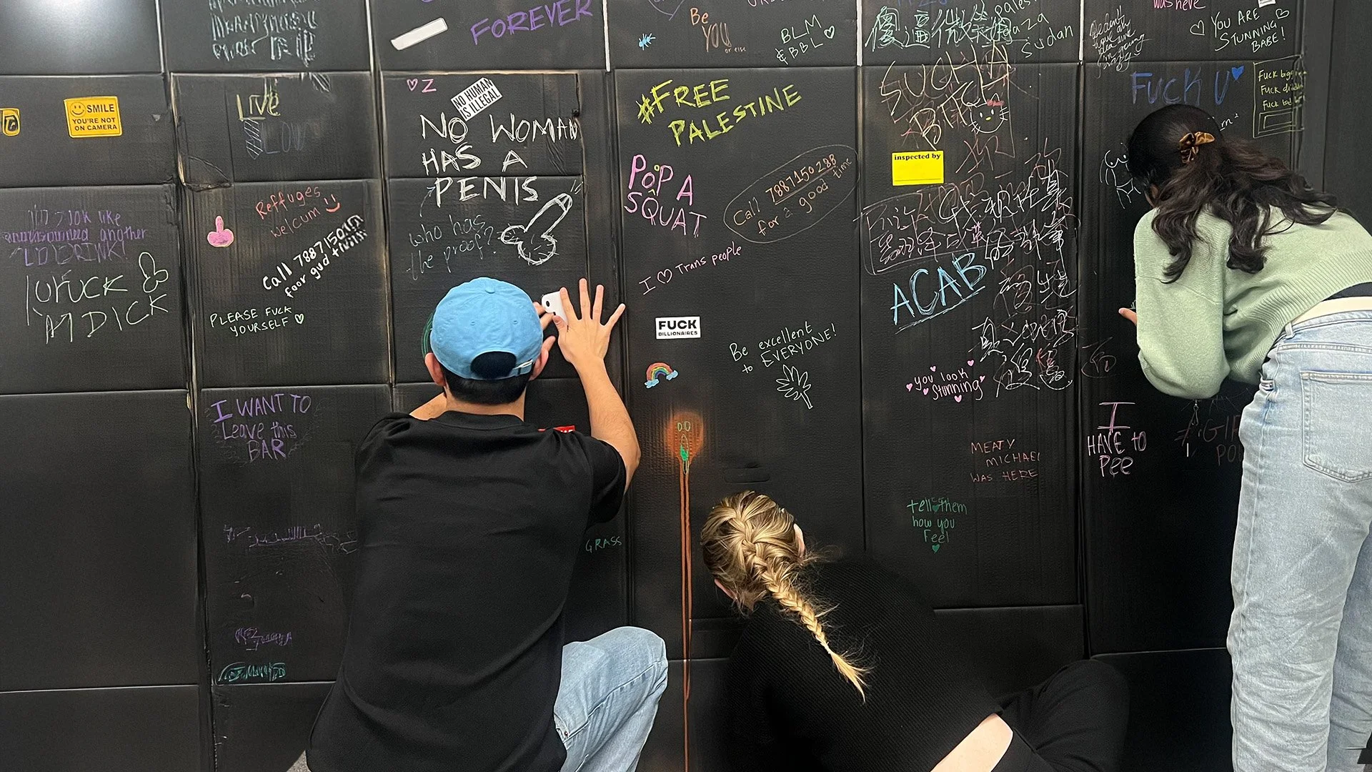
We wrote down our thoughts from visiting the pubs and sorted them into categories. From this, seven themes emerged: iconography, handwritten type, heritage, ambience, serif typefaces, signalling and toilet graffiti. When toilet graffiti appeared on the pink Post-it, the group got excited. It was a space we wanted to explore, but one we hadn’t considered at the start of our research.
Fig. 1. Initial thoughts on topics mentioned in the brief.
Affinity Mapping
Our feedback was to explore toilet graffiti over pubs but more importantly, to pause and interrogate why we were drawn to it in the first place, to understand what about it got us excited and let our research of this inform our experience.
References:
Mr Bingo (n.d.) Hate Mail. Available at: https://mr.bingo/hate-mail/ (Accessed: 15 January 2026).
Venturi, R., Scott Brown, D. and Izenour, S. (1977) Learning from Las Vegas: The Forgotten Symbolism of Architectural Form. Revised edn. Cambridge, MA: MIT Press.
Fig. 3. Examples of simple text used to direct attention.
During secondary research, I came across a super fun initiative by London-based illustrator Mr Bingo called Hate Mail, where he posts hand-drawn, intentionally rude postcards on request. This made me think about how the materiality of the postcard changes the way the text is experienced.
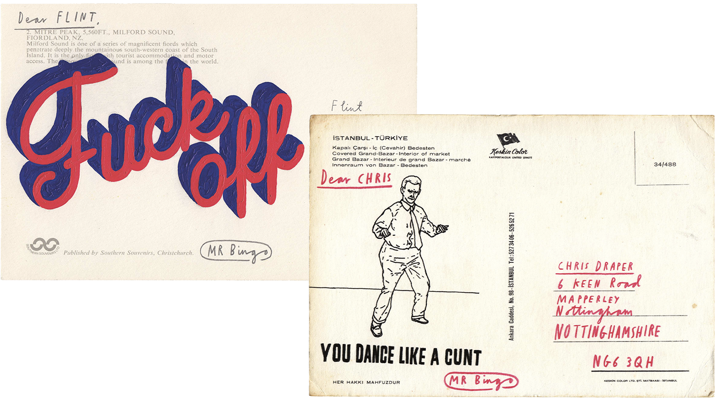
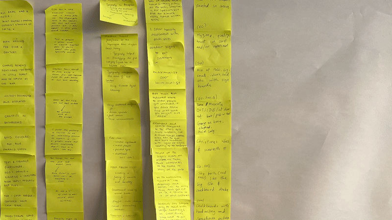
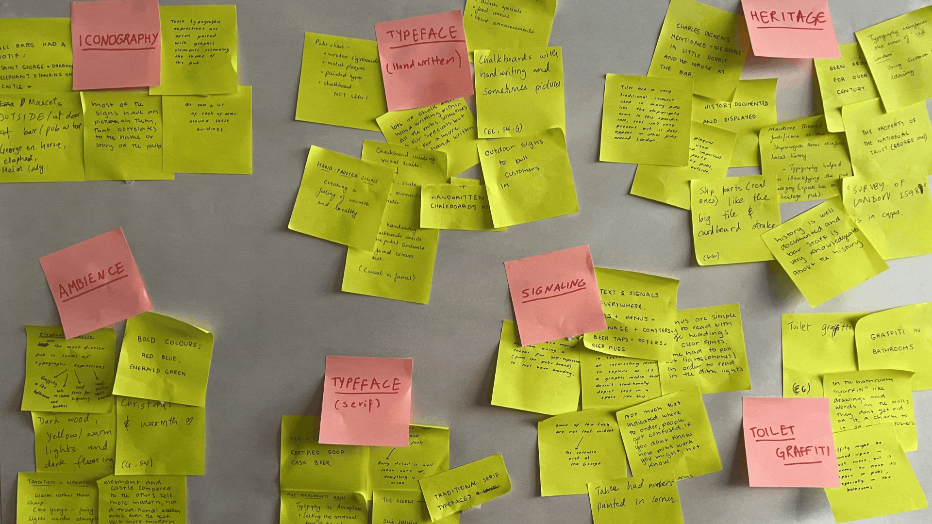
Fig. 6. Affinity mapping exercise following pub visits. Photography by author.
Being in London, surrounded by wayfinding, advertisements, traditional signage and hand-painted text, it made sense to explore the city itself. We started our day with some pub-hopping. Entirely justified in the name of research.
Apparently, the area Elephant and Castle was named after a pub of the same name. Although we had hoped to find traditional interiors, the space had been renovated over time and felt more contemporary than expected.
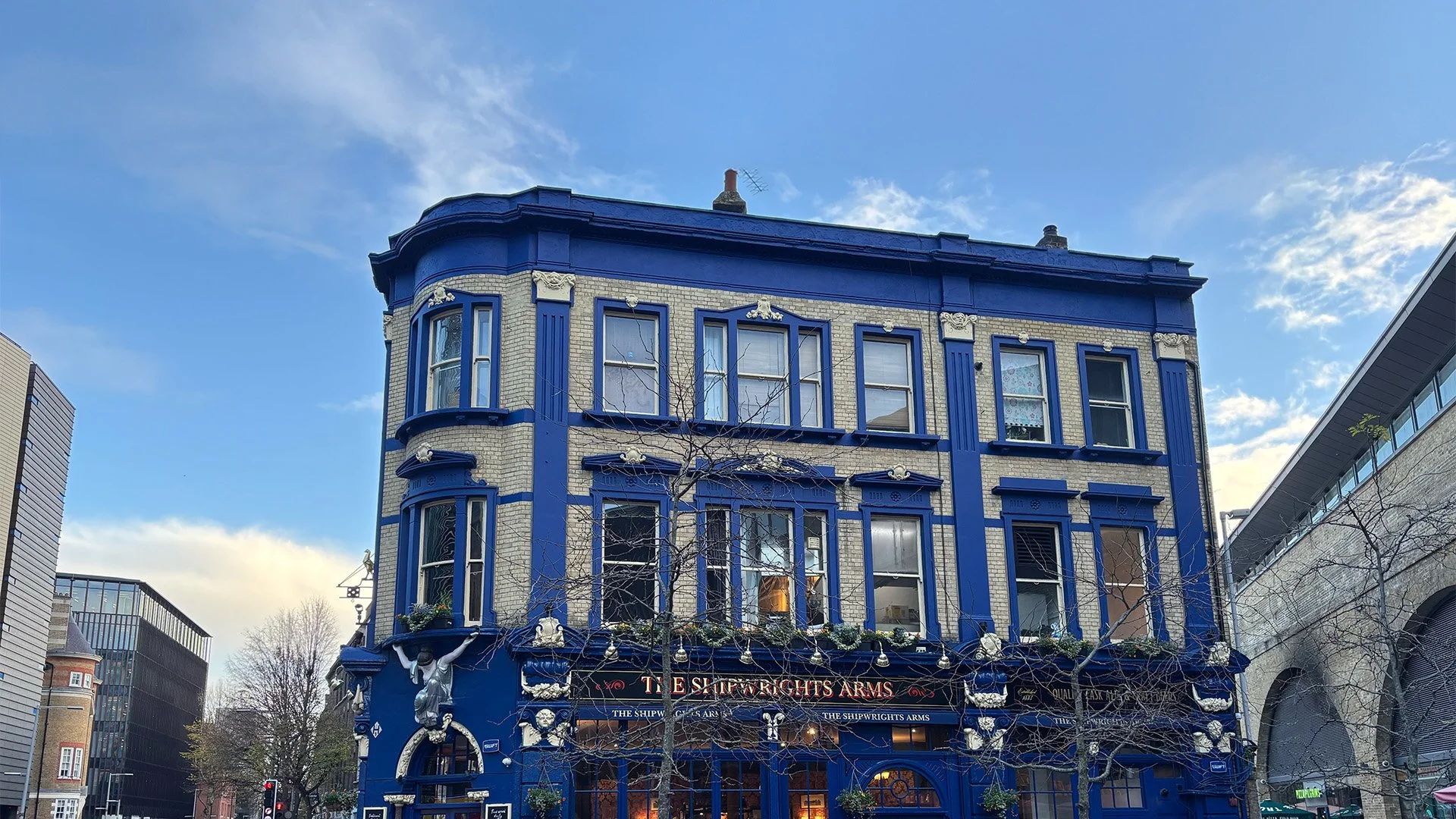
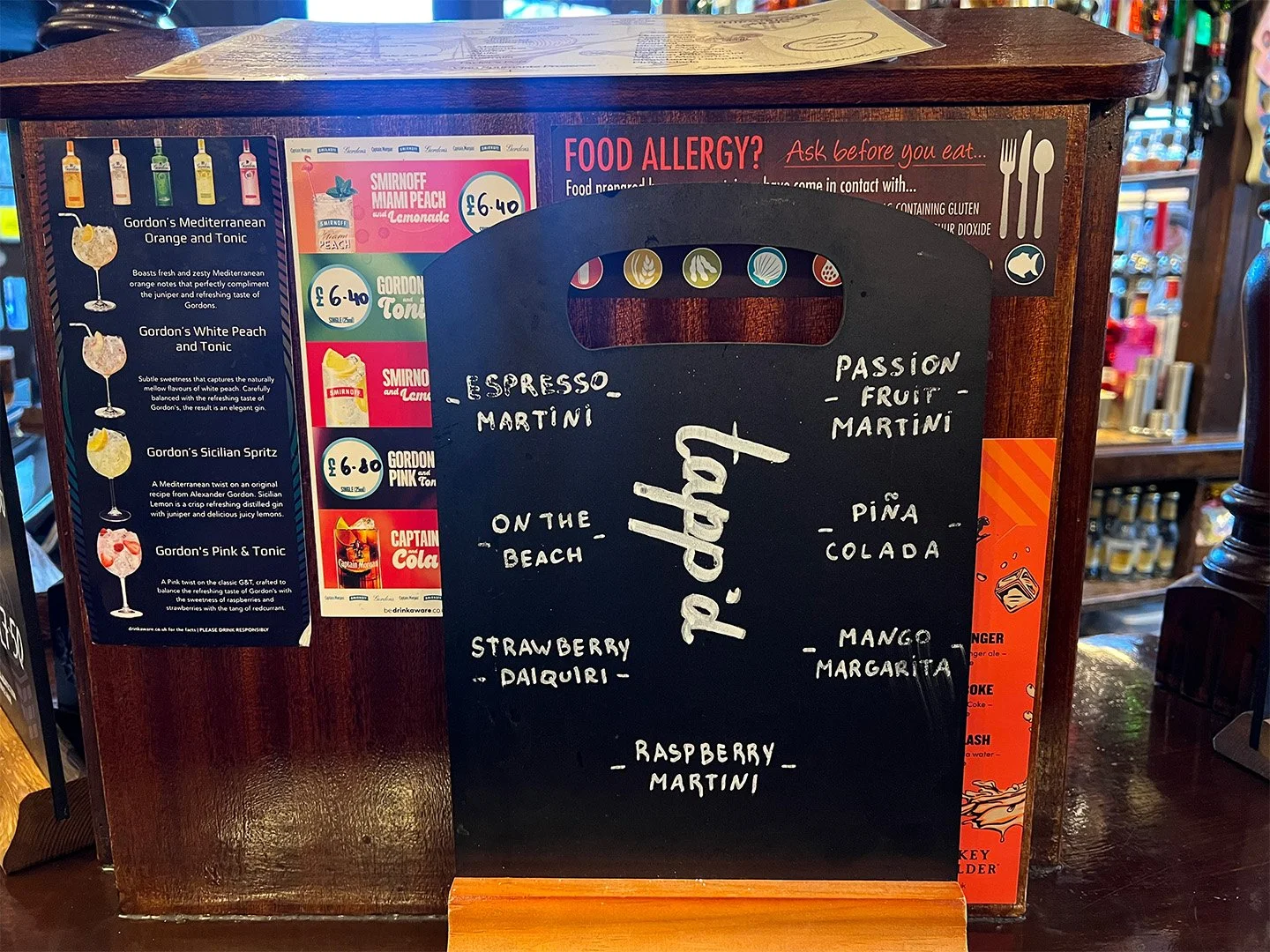
At The Shipwright’s Arms, we found more of what we were been looking for. Traditional hand-painted signage, alongside ship-themed visuals, handwritten chalkboards, advertising discounts and card payments stickers, branded beer mats, coasters, glasses and labels.
Just textures and layers of text.
Next, we visited the George Inn, which Charles Dickens is said to have frequented. It felt traditional, yet more elegant than The Shipwright’s Arms. We also learned that many British pubs were given simple names and visual motifs, such as The Red Lion or The Crown, so they could be easily recognised at a time when literacy was low. After, we came across the “Take Courage” ghost sign, a reminder of how text can endure in the city.
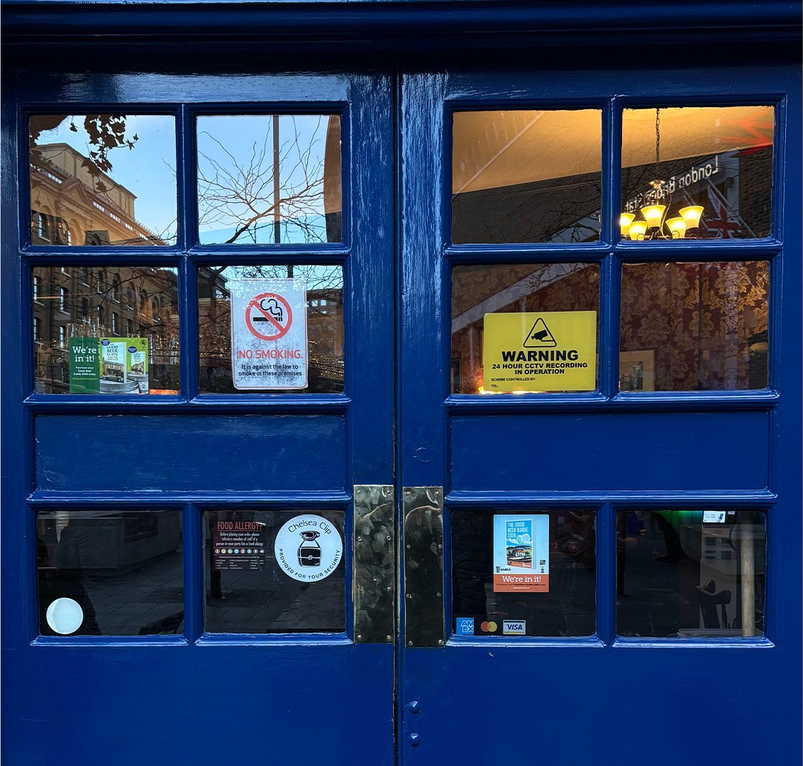
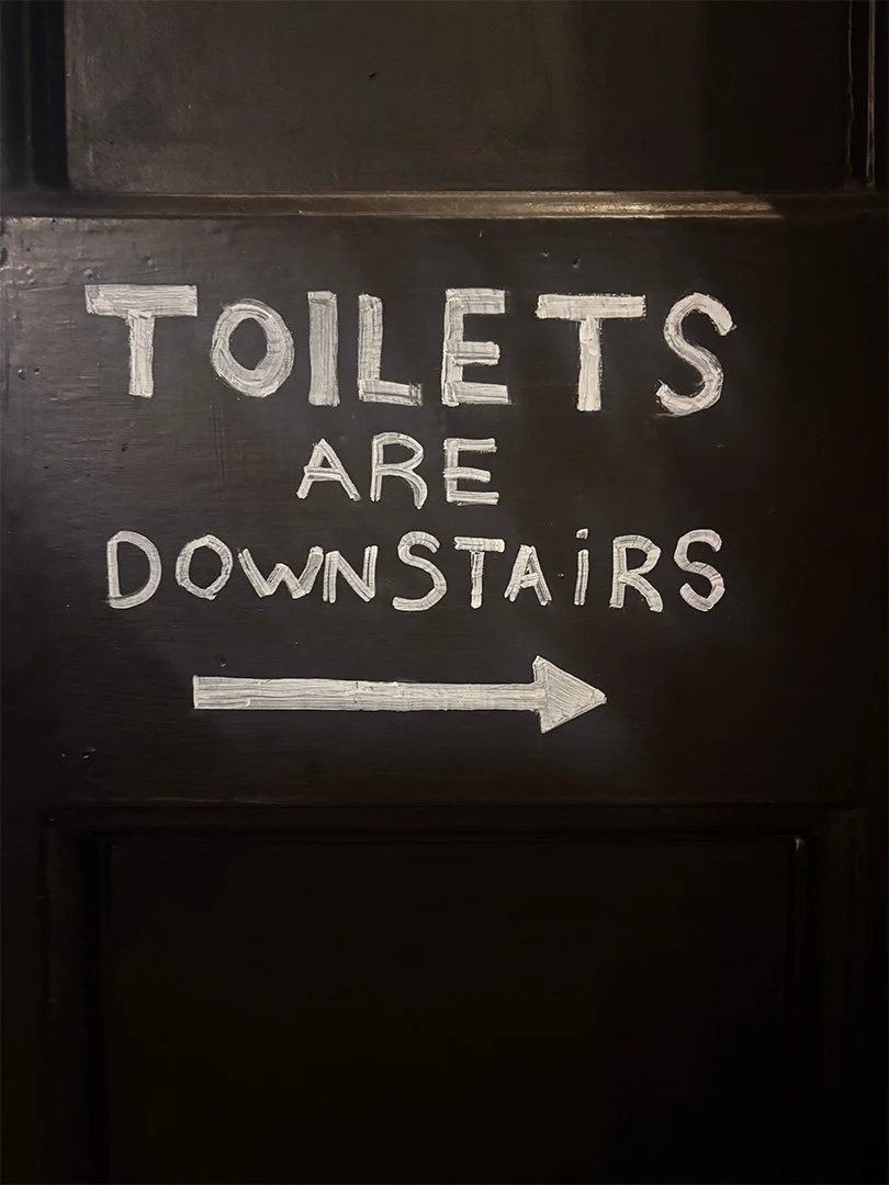
Fig. 4. The Shipwright’s Arms, London. Photography by group.
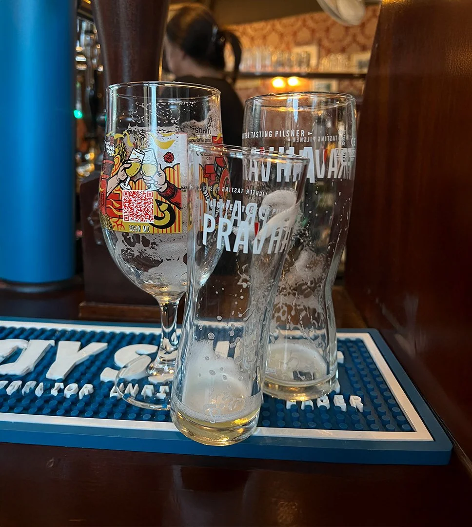
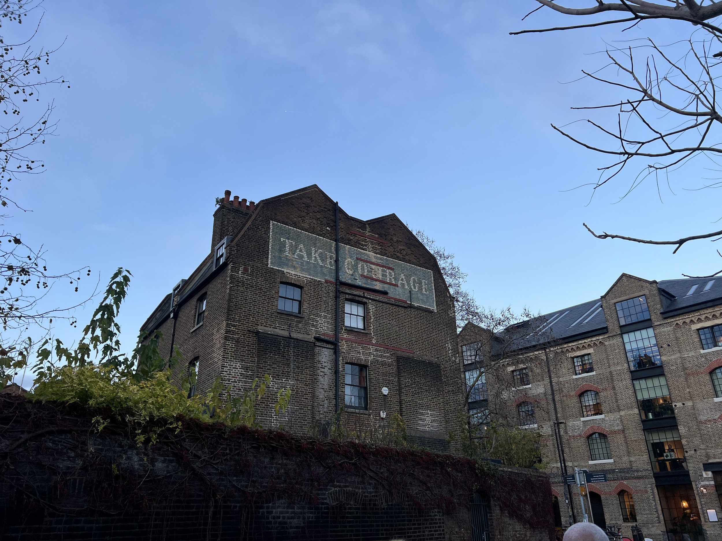
Fig. 5. Take Courage ghost sign, London. Photography by author.
Fig. 2. Hate Mail postcards by Mr. Bingo.
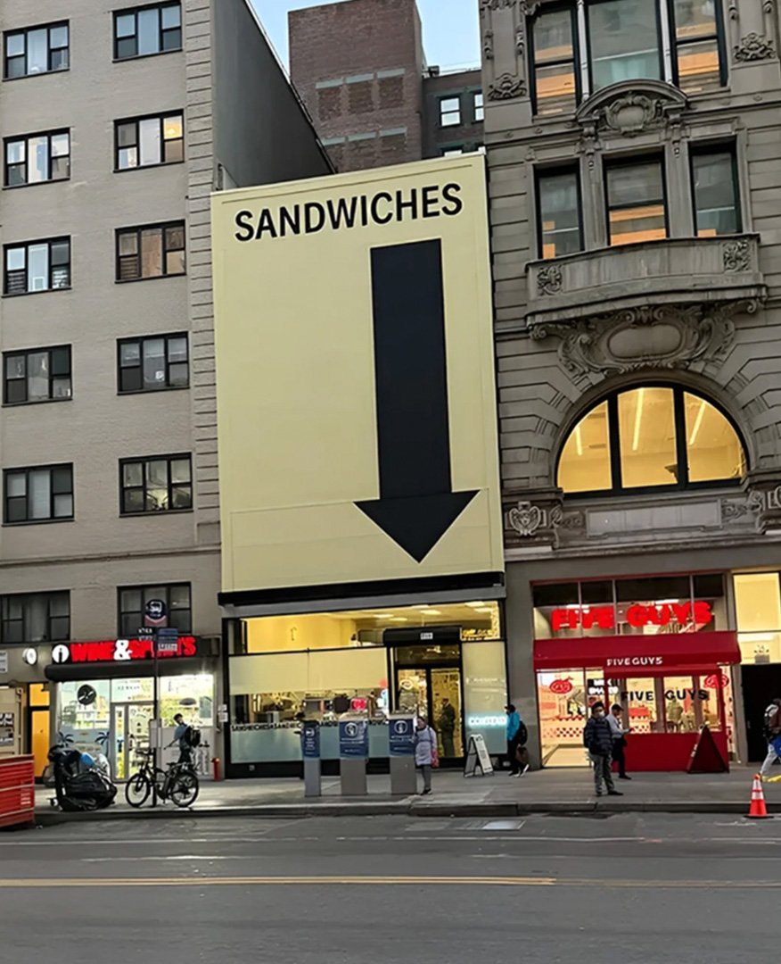
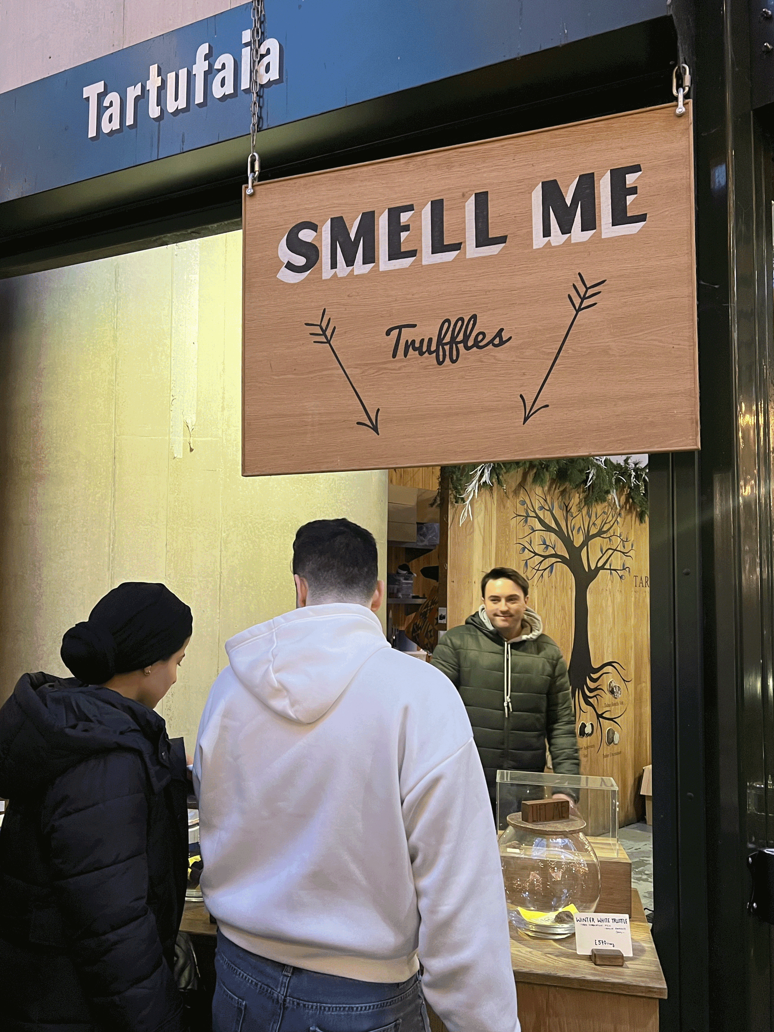
The group briefly discussed Counter Service NY’s viral billboard that simply read “Sandwiches”, with an arrow pointing towards the shop. While walking through Borough Market (Fig. 3, middle), we saw the same mechanic play out. A sign reading “Smell me” pointed to the truffles, and people actually did. There’s something powerful in the simplicity of an instruction.